White Room Challenge, the lighting episode. This is the last episode of season 1. Tis bittersweet BUT we do have Design Star rolling into the same time slot and thats exciting. (I will be writing reviews on Design Star as well) Anyways lets get down to business. This episode the designers were going to be judged in the dark… because the challenge was lighting. They are also judged on how well they used lighting and shadows, and how strong of a concept did they have. Here’s what I noticed in this episode. They were not told they had to design a room. In my episode we clearly had to represent a type of room, and come from an interior designer point of view. I didn’t hear that in this episode, and I didn’t hear them being told not to do an art installation. (I did hear that in other episodes) However designing the majority of their room in the light and only have a few moments of lights out to evaluate what the room would looked like being judged makes the challenge even that more difficult.
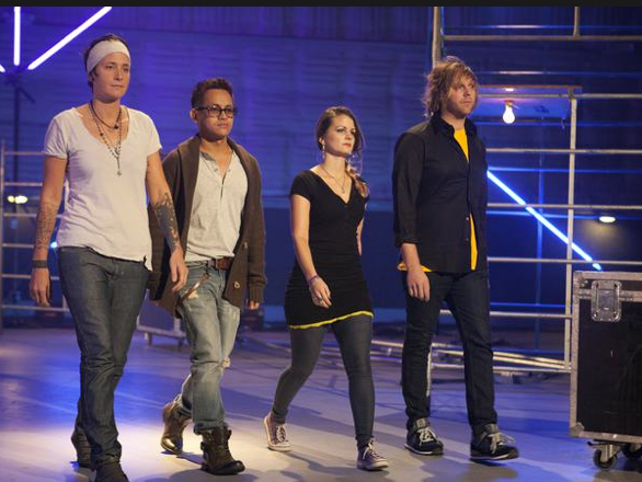
Here’s this weeks crew. We have Tiffany ‘Torche’ Perkins. She’s a metal sculpture and inventor. She like me was also in the military. She’s definitely a bit of a trash talker. Clarione Gutierrez, he’s a freelance designer and a speed painter. I’ve never heard of a speed painter before, but it looks pretty awesome. Jessica Goudreau aka Peanut. She a designer from New York and specializes in restaurants, nightclubs and cruise ships. And lastly Eli Levenstein, he’s an artist who designs one of a kind furniture pieces and “environments.”
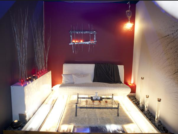
Alright so onto the rooms. Torche’s Sexy Lounge. Can I just be totally honest and say I don’t feel sexy or lounge. When I think of sexy lounge I think of mood lighting, dim and sexy that light up just the right areas in a dim space. I don’t think of bright light up floor. I do like that she framed out the floor and light it from the bottom but it’s soooo bright. In fact it’s taking away from the tubes she lit and filled with broken light bulbs. I like those I would have liked to see more of those dimly lighting the space, rather than the jarring floor. I appreciate she used the bulbs in the coffee table build and she didn’t light them, it’s artistic. The metal sculpture is beautiful as it should be because she’s a metal sculpture. She didn’t say she was an interior designer and I have to say she struggled a bit with scale in here. The metal sculpture is small compared to the size of her back wall and sofa. The light hanging in the corner is bitzy. The rug is too small. I would have liked to see a bigger rug that would have diffused the light coming from her floor. Maybe a rug with cutouts that would have giver her blank wall some shadows. All in all I love her metal work but I don’t think her room represents her concept very well and Torche takes home 3rd.
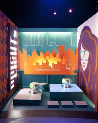
Clarione’s Bright Lights, Big City. All I have to say is I love it. He painted all that art freehand… hooray to that. Clarione is a painter and I’m glad he choose to show off his talent. The concept is strong. There really isn’t much I would change about his space. I do agree with the judges that he could have put gels over his bright lights cutouts so the glowing sunglasses of his lady would have shown up more. I love the whirlybirds used on the block to represent tops of buildings. I love the layering of the buildings in the back. I do have to say I was slightly worried for him because I wasn’t sure if he was going to be criticized for doing more of an art installation than a room, like my favorite robot from a former episode. But the judges loved it. Great job Clarione, you deserved the win!
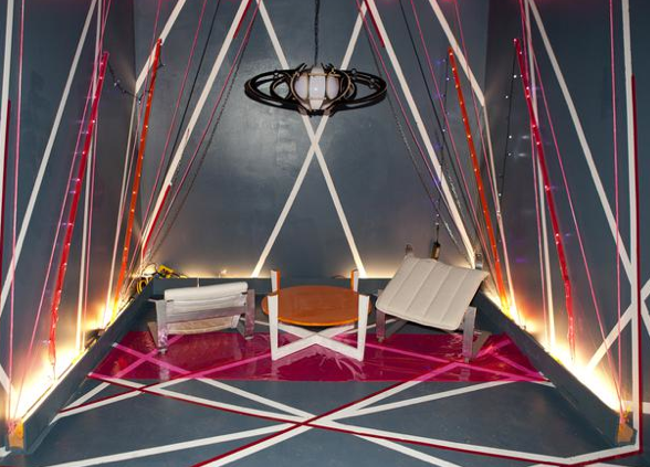
Jessica’s Late Night lounge. Another lounge, and again like Torche I’m not feeing lounge. This feels a bit more laser tag to me. And she’s another victim of paint with the tape graphic effect. Don’t rely on this to make or break your room, use it to enhance your design, but remember it’s been done over and over and over again on White Room. It looks a tad messy to me. The colored tube lights remind me of space mountain at Disneyland. The furniture looks messy or broken or tipped over… actually I’m not exactly sure whats going on with the furniture. Jessica you said you designed cruise ships, I’ve been on a cruise ship and really wanted you to give me crazy seahorse, pastel green and purple wonderfulness. I love a tacky cruise ship and wished she would have taken it that direction. Instead I’m left with laster tag sloppiness. Jessica takes home 4th.
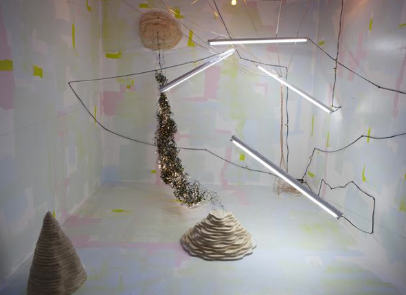
Eli’s Outer Space Underground. Ok this one is hard for me to critique. It is clearly art, and art is subjective. I appreciate his artistic point of view and in fact I actually like this… as an art installation. Eli and Carione both did art installations, and they were the top two so I guess that didn’t matter this episode. Eli’s fluorescent lighting overpowered his space. He left the majority of his room white which is reflecting the bright lights even more. He lost all shadows in his room, and I think thats what lost the challenge for him. He did use the paint after he saw that the shadows were lost. I know a lot of viewers aren’t going to understand Eli’s space. It’s art, but I do love it. Eli takes runner up but he is someone who is going to be talked about long after this show.
So season 1 of White Room Challenge. Truly a fun show and it seems they are dreaming up harder challenges so good luck season 2!! Maybe there will be an all stars edition, who knows…
-Bex

