Sorry it took me so long to post my review. I try to get it up the same night or next day but I was super busy and yesterday I was lucky to meet fellow winner of HGTV’s White Room Challenge Clarione Gutierrez. He designed the amazing Bright Lights Big City display in the lighting episode AND he’s an amazing person as well.
Here is something that was clear to me this episode. The designers had to have been given a cohesive color pallet from Kris Jenner Kardashian. All the rooms were all grey, with chocolate floors and darks woods. So the designers needed to find creative ways to work within what the client wanted and bring themselves, and their style and make a wow moment. The best room in my opinion was…
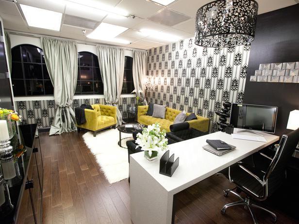
Rachel and Stanley. Rachel is proving herself to be the designer to beat… but Stanley is finally finding showing us his stuff. I love that Rachel brought in chartreuse. It’s a tricky color to get a client on board but the room needed it. I am not however a fan of the wallpaper choice. Just isn’t doing anything of me. Do remember that this design aesthetic is so far removed from mine it’s harder for me to critique. I like Stanley’s waterfall desk and they had a good camera challenge, and over all it was a good job. My only critiques are the drapes look messy. It’s too much volume, and I don’t like the sheen. There’s plenty of glam going on: in the desk, the chrome accents and the wallpaper. Maybe a simple flat panel grommet drape swould have been a better choice. Also I would have loved a vintage or vintage inspired piece thrown in. It would have given the room interest and character. You can do vintage in a modern glam hollywood space. It’s all about context my friends.
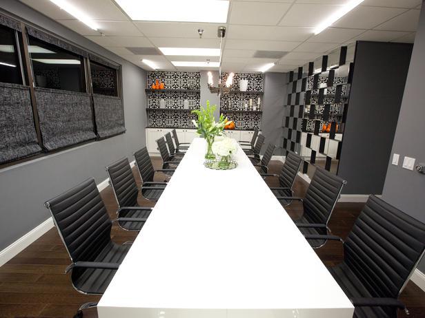
Up next Britany and Mikels conference room. I will say it was the easiest room in my opinion. That is nothing against Britany and Mikel, the room was chosen at random. Mikel found a white lacquered Parson’s table and bought two to make a large enough conference table. Smart yes, but not necessarily a genius moment. I’m still not seeing Mikel’s point of view, he mentioned he was into vintage, I’m not seeing it yet. I want to see your aesthetic come though Mikel, I’m still rooting for you. We do have to remember that he is limited to his shopping sources but thats where uber creativity needs to come into play. This room reads very Britany to me, like the first challenge. The mirror wall was the perfect moment for Britany. It’s bold and graphic like her lattice wall from the first challenge. Kris wanted mirror and Britany brought it in a creative way. It looks like she bought a bunch of 12 x 12 beveled mirrors and applied plywood to the back of 1/2 of them and adhered them to the wall in a checkerboard pattern… clever. One note is be careful not to become a one trick pony. You can’t repeat on TV like you can in real life. The mirror wall reminds me of the lattice wall and I worry if she does another 3D wall in the future it is going to be looked down upon. The camera challenge was very hosty. Britany and Mikel are cute, fun and I didn’t get their personalities coming across in the camera challenge. But it takes time to find your comfort level on camera, so I’m sure they will work the kinks out.
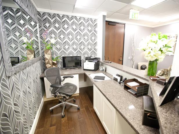
Kris and Miera’s reception area. Ok these two did not work well together. Kris hasn’t done well with partner challenges BUT I will say I found moments where I really liked Kris this week. He seems difficult to work with but maybe thats because he’s so confident in his design style and knows what he wants. You are going to have bickering anytime to take two type A personalities competing for the same prize but told to work together. His camera challenge was better but not great. The winner wins their own show so Kris is going to need to work on his likability factor or no-ones going to want to watch him. Miera to me is starting to feel defeated. Her elements in the design were good but she got emotional when prepping for the camera challenge. I will say because I have worked behind the scenes for a design show, THIS IS NOT EASY FOLKS. The stress can be insane and its so different from real world design. I think a combination of those factors affected Miera. She needs to pull it together and refocus or she’s going to go home. No red flags in this design but no wow moments either.
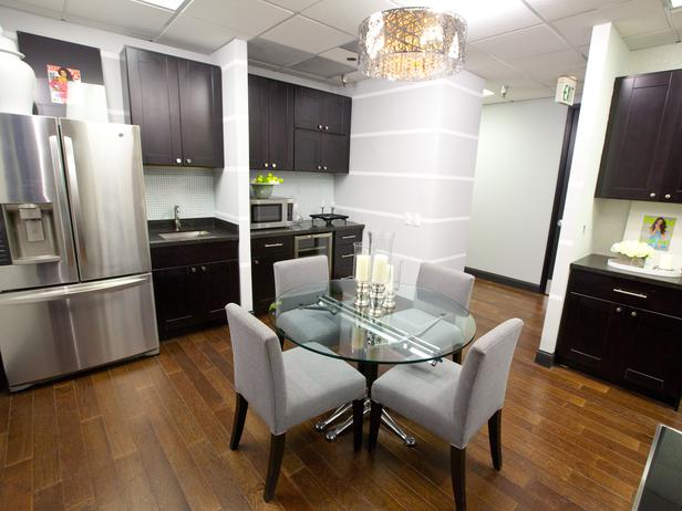
Hilari and Danielle. They had the best camera challenge and I really like both of them. Danielle has shown her point of view and I’m still waiting to see a bit more from Hilari. They had one of the harder rooms to accomplish. A kitchen, PR closet and makeup room. But guess what it looks like all the other rooms. Honestly all these rooms look the same, I’m not seeing any designers bringing themselves into the space with the exception of the chartreuse sofa from Rachel and thats probably because it’s the ONLY color in the entire office. All these room check certain boxes, glam factor, graphic wallpaper, grey walls… The kitchen didn’t get a graphic wallpaper but more of a textured diamond wallpaper. So yeah it was nice… but doesn’t read on camera at all. There was a uh-oh moment in the room when for whatever reason Danielle wanted to DIY wallpaper the enclosure for the closet and it didn’t turn out. So they hung curtains to cover the damaged walls. Here’s my opinion on that, NEVER DIY wallpaper. It’s not easy, just hire a professional or don’t do it. Can’t afford it??… try a wall stencil which is much more DIY friendly. And the damaged wall… really no big deal… fix the drywall, paint and done. In a timed challenge they didn’t have time, but I don’t think anyone should go home over such a glitch.
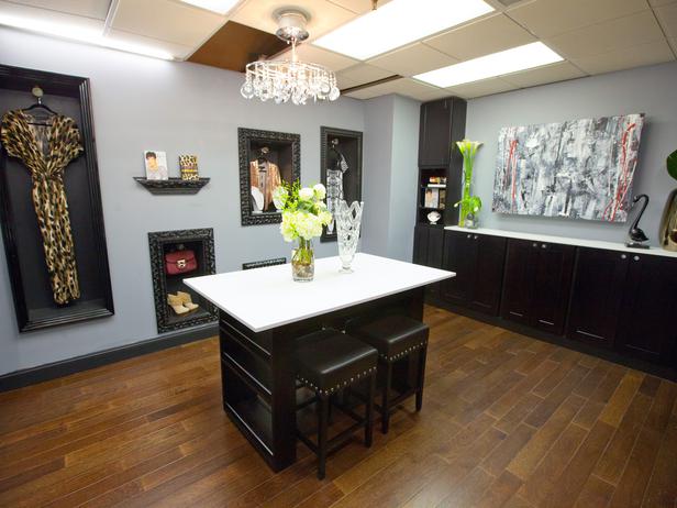
And last we have Bex and Luca. I’m sad to say I think Luca got to Bex, and she made some questionable choices and unfortunately she went home. Luca went home too, which I expected after last week, BUT I’m still disappointed because I still think Jordan deserved to stay and I would have loved to see Jordan’s take on this challenge. Luca needs a “timeout” attitude adjustment. I’m shocked even in his exit interview that he thinks he’s that much better than everyone. Do you not have eyes?? Reality check Luca, you were one of the weakest from challenge 1. This room, looks disjointed. Luca’s island is too small and honestly it’s just an island. Nothing special. I would have loved to see a rug and interesting piece of furniture functioning as an island to give this room something!! There are no soft surfaces in here at all. Bex’s display walls while clever feel a bit haphazard. (a shootout to Jason the carpenter WHO helped build that wall AND was my carpenter from White Room Challenge) And then there were those honeycomb shelves (not pictured here) although they bring interest they didn’t go with the rest of the room. Bex and Luca never have a solid game plan because they couldn’t play well together and it shows. If you want to design for TV you have to work well with others…Luca. You are not God and the crew does not bow down to you… they are your team and you need to work together as such. The art is nothing special. Hearing Luca say he was going to take the room colors and make art sounded like fingers on a chalkboard to me. Don’t match your art to your room! The art shouldn’t clash but it should never “match” blah. I may seem hard on Luca, but I’m upset Bex went home so early because of this challenge.
So hopefully we get to see a bit more of the designers signature style next week. This week we clearly saw Kardashian style, and not too much of the designers flair mixed in.
-Bex

