Alright, the suspense is over. Last night we finally got to meet the cast of Design Star and see if their work lives up to, or exceeds their portfolios that were posted online. The show started out with intro’s from the cast, photos of their portfolios and them gathering talking about their styles. No real red flags on personalities yet. Luca acted like a bit of a know-it-all saying he could do everyone’s job, but everyone else seemed nice…. so far. So out pops David Bromstad who is not both the host and mentor this season. This weeks challenge is to makeover their LA mansion. The designers will pair up with their assigned partner and design either a bedroom, great room, den or design studio. They also had brought an item from home with represents them that needs to be incorporated into the design.
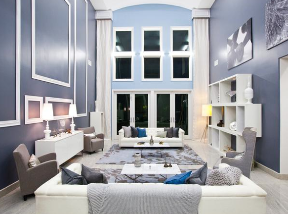
Alright. So up first the great room. Design by Danielle and Luca. Can I just say bravo. One thing I liked about this season is they told us the designers had 3 days, and a painter and a carpenter to help them complete their rooms, in fact I saw our carpenters from White Room Challenge, you guys rock! Anyways that makes a huge different having that help. The designers also have to deal with where ever production allows them to shop, but I will say I am from LA and they got to shop some great places. So overall great job guys. My critiques may seem nit picky because overall the room is stunning, but here I go. I am not a huge fan of the blue accent wall. The grey is so beautiful I would have just taken that color all the way around the space. It would have allowed those dummy drapes to pop more with a more saturated grey behind them. The only other issue for me is the furniture arrangement. It’s looks nice, is a great scale, but it’s not really functional. If your sitting on one sofa, you can’t really talk to someone on the sofa across the room, unless your yelling. The chairs are all facing the middle of the room, so it just doesn’t lend to anyone being able to have conversations in the room. Maybe they could have used the two rugs to define two furniture group, and not every piece of seating angled towards no-mans-land. However this is TV so they did arrange the furniture so it looks great on camera. Over all great room.
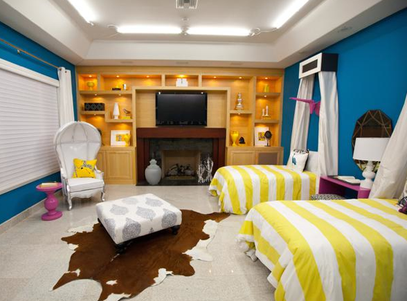
Up next. Britany and Mikel’s bedroom. Hello color. David Bromstad loved this room and I can tell why. The colors are bold saturated and complement each other nicely. The bight blue even complements the blonde wood build-in which they clearly couldn’t alter during their makeover. I can tell they did a lot of their shopping at West Elm. Britany did a big 3d lattice wall which was stunning. Bravo Britany. This room looks like your style and that an important concept to get across from the show. Mikel says he’s more vintage but maybe they couldn’t shop a vintage store so he did what he could to bring in his style. The ottoman reupholstered was clever. It wouldn’t have gone in the room with it’s existing red upholstery. The confessional chair is a nice moment in the corner with the pink table. Ok so the only changes I would have made to this room are: The ottoman is floating with no point on a random hyde rug. The floors are cold and tile, I would have liked to see a big sisal or jute rug rug on the floor with the hyde layered over the top so it didn’t seem as if fell from outer space. The ottoman idea maybe could have been done with a bench or furniture piece for the end of the bed so it had a bit more purpose. The pink is being pulled from the pink accent pillows but those pink taxidermy’s are a very “Antonio” moment from previous Design Star season. And last I’m not a huge fan of the canopies above the bed. I’ve seen it done before. I would have liked maybe Britnay using her lattice work into some kind of headboard. Overall amazing room guys, can’t wait to see what you are going to do in the White Room!!! #teambritnay #teammikel
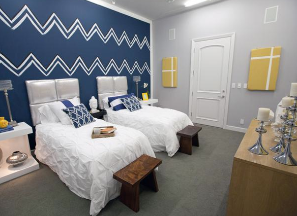
And here’s another bedroom. Miera and Jordan’s bedroom. Let me just say I love Jordan’s accent, I would watch your show just for your accent. Anyways onto the room. Again this room feels very “West Elm.” And believe me nothing wrong with West Elm I love the store, I just think for a design competition you don’t want your space to feel like a stores showroom, it needs to feel original unexpected and inspiring. Those elements are what are going to make people want to see more from you. The chevron wall graphic. Love it. Chevrons are all over the place right now, if Miera would have just taped it off and painted it I would have thought it was expected. However sense she free-handed it, it gives it a bit more organic less “perfect” feel and I appreciate that. Jordan’s table he designed and brought from home speaks clearly to his style and fits right in this room. This room clearly had the easiest floor plan. Both the bedrooms were pretty straight forward but this room was a smaller scale, which makes it slightly easier. The colors are pretty. The room is pretty. No wow moment in here, but no red flags either. I can’t wait to see what Miera and Jordan accomplish in the future.
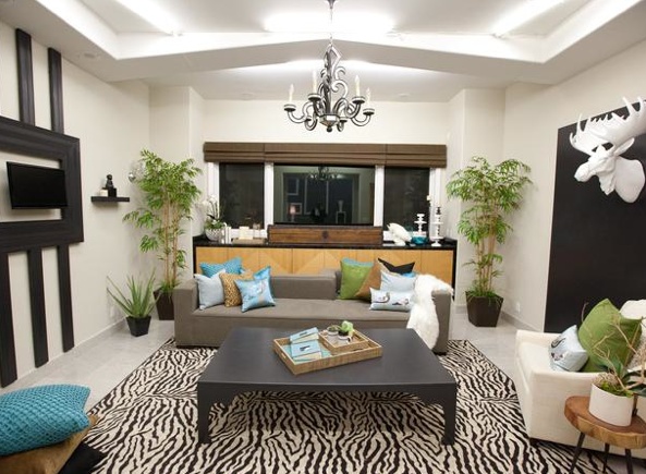
Hillari and Rachels den. Another more humanly scaled room in the mansion. Overall I like it. I will say I LOVE that you brought in live plants. That is right up my ally. I’m obsessed with that sofa. So glad you picked it Hillari. I love the black accents, black is a color a lot of clients are afraid of, and Rachel your choices are done to perfection. Whats not perfection is that tiny tv. It was addressed by the judges on the show, I think if Hillari would have just painted the inside of the molding black it might have helped. The choices in here work well with the existing built-in. The only thing I’m not a huge fan of and it’s a personal issues is the rug. I don’t mind an animal print at all, I just wish the scale of the print was bigger so it looked a little more updated. Again thats a personal choice, there is nothing wrong with the rug at all. Nice job ladies.
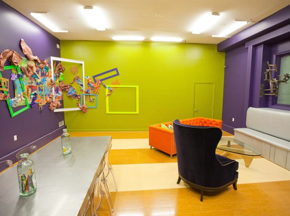
Awe yes, the design workroom and lounge. By Yuki and Stanley. Can I just say this room is yucky Yuki. The only thing is here that is working for me is the flooring and the metal sculpture. Everything else can be trashed, in fact thats where the wall mural looks like it came from. The best explanation of the wall mural is “Color Splash’s trash can threw up on the wall.” Sorry guys, its not good. It wasn’t good before the trash and frames and really not good after. The wall colors are horrid, and then on top of that color Yuki wanted to throw in a bright orange sofa. And it gets worse, the furniture is on a weird angle , and it’s just floating with no rug or anything to ground the group. My biggest issue is this is supposed to be a design work room but how can any designer function and get inspired with all that harsh color. Dare I say I would want my workroom to be white so that it wouldn’t complete with the projects I am working on?? Yuki went home first. No one wants to be the designer to go home first so I feel for you Yuki.
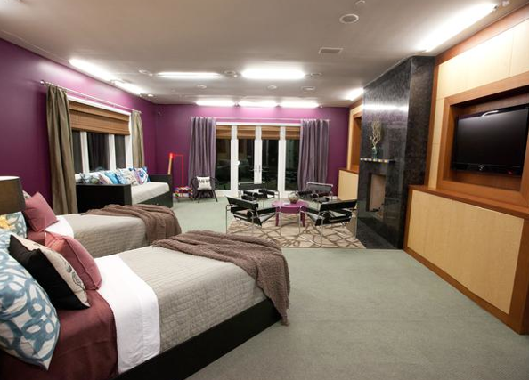
Last but not least Bex and Kris’s bedroom. This was the hardest bedroom by far, just based on the shape of the room. The idea of the two twin beds and the daybed works, the day bed is just visually too heavy for the space. Bex had a neat idea to cut star constellations out of the daybed but the execution fell short. But that wasn’t nearly as bad as Kris paint color. If the color wasn’t bad enough he even went as far a using a semi gloss, a no-no on camera. It’s reflective and will reflect all the camera lighting, and not in a good way. I like the idea of the pops of neon happening in the art and the tape table but why make that compete with such a heavy wall color? The Wassily chair is ok, nothing exciting. The bedding is blah but looks neat (except for those throws) I don’t like the drapery color with the wall color. I loved Bex’s art with the hand, and I liked the tape table and the match. I don’t’ like the rest. Kris seemed a little bossy and I see much more of him in this room than Bex. I can’t wait to see what these two have working on their own next week.
Overall great episode, dare I say one of the best first episodes so far!!?? The cast is really stepping it up this season. I can’t wait for next week to check out those white rooms! I think that is the episode where true creativity really shines.
-Bex

